

Creative experiments showcasing my skills in Cinema 4D and Redshift. Not affiliated with or commissioned by the mentioned brands.
SUGAR PAPI
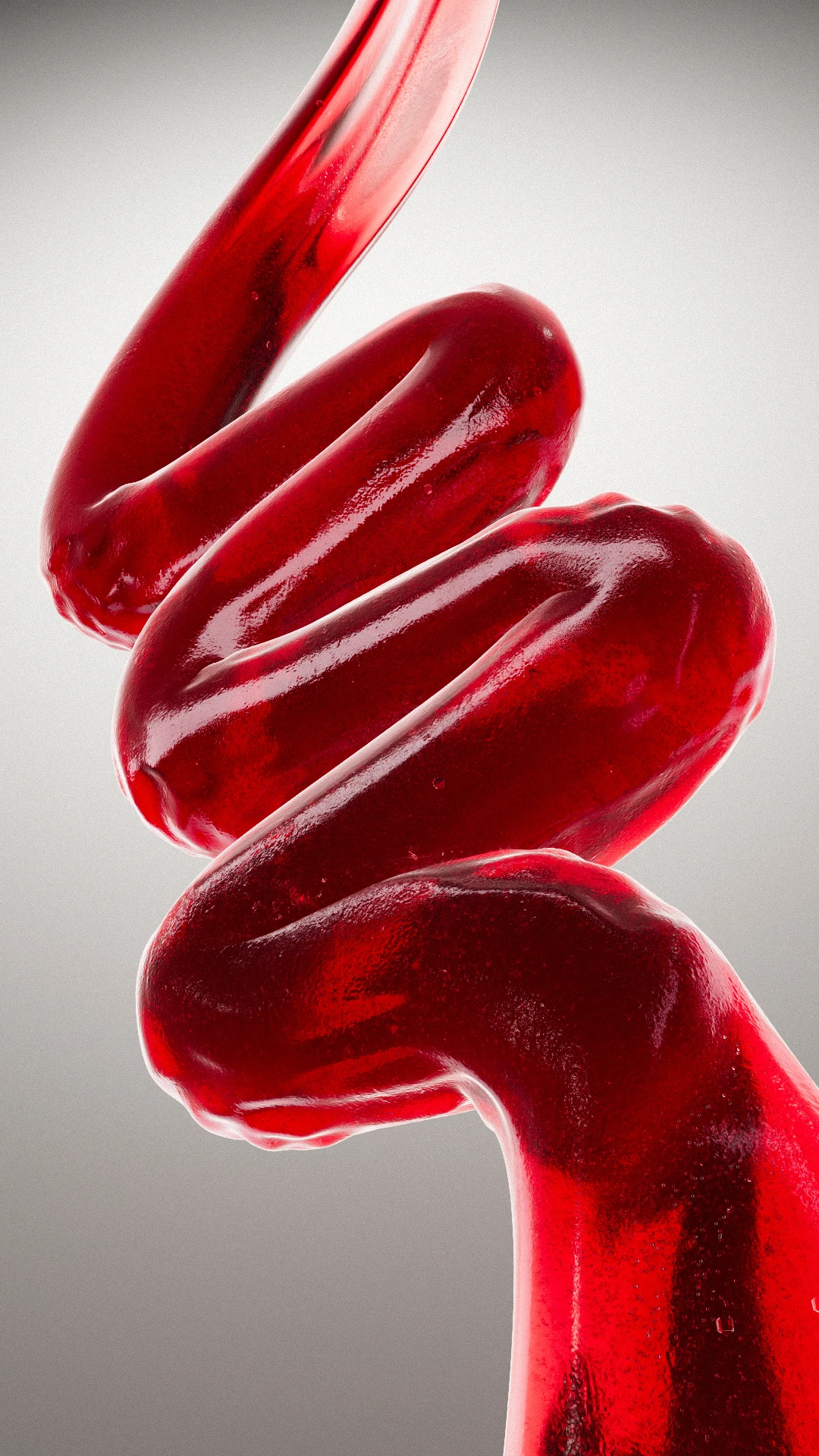
Project inspired by Peldanyos’ Sugar Papi jams. I set out to translate flavor into form and
build a
typographic triptych where each recipe shapes a brand initial.
I handled Art Direction, lighting, and shading. I designed each letter as a viscous sculpture, forming the
initials “SGP” that reference the brand’s name. It reads like a thick-fluid simulation, with embedded
bubbles, micro-tears, and wet highlights that evoke the body of jam. The palette is straightforward and
appetizing; the neutral background and symmetrical composition ensure instant recognition while scrolling.
The result is a clear, appetizing piece that turns flavors into visual identity. It works as a key visual
for social, launches, and graphic assets, showing how the product itself can become living typography.